With the advent of digital technology, the Christmas card tradition of years past has drastically changed. Fewer and fewer “store bought” cards featuring Christmas scenes are making it to mailboxes.
Now it’s the family photo card that lands in your mailbox, email inbox….or both. Which one do you send? Or do you send any Christmas cards at all?
.jpg)
Creating your own cards is a breeze with all the drag and drop card templates available, but, to get it right there are a few VERY important design tips to know.
Here are our top 7 simple tips:
1 – Choosing photos
Image selection is all about what you look like now. It’s not about places you have traveled or events of the past year. It’s YOU your family and friends want to see, especially those who live far away and don’t see you as often. They want to see YOU….up close and personal.
2 – Full or Vignette
So what is the difference between a full image and a vignette? Plenty. Full images are head to toe shots of the whole group…..but not necessarily the whole building or landscape behind you. An image vignette is a close up of faces cropped at the waist, shoulders, or neck. Include both. Family loves to compare growth from year to year.
3 – Image Sizes
Use large (300 dpi), good quality images that fill the frame. That doesn’t mean elbow to elbow cropping with no space around those in your photo. Use space, but use just enough. Here’s what we mean….
.jpg)
4 – How Many Images?
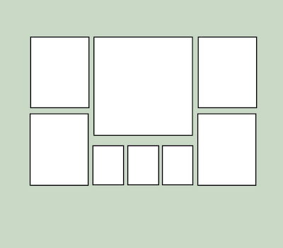
The old saying that “less is more” applies here. A 5×7 card only has so much space so avoid cramming too many tiny images in to get your story told. Use social media for sharing lots of images. Remember, this is a holiday greeting card, not your year-at-a-glance.
5 – Image Exposure
Friends and family want to see your faces so make sure the image is light enough to see detail. Know that paper will print darker than what you see on a digital screen. Why? Press printed products use 4 colors (CMYK) while digital screens (RGB) use thousands. Make sure your card print company adjusts your images or do so yourself with photo editing software.
6 – The Artsy Stuff
Doo-dads and little artsy stuff have a place but should only add to, not be the focal point of your card. Remember the card’s purpose…..seeing YOU.
7 – Legible Type
Any message you include should be an easy to read font and not too small. If any font used is less than 10.5 pts, it’s too small. Shorten your message or add a newsletter to the envelope if you have more to say. And, only list names of individuals in the photos and be sure to add the year.
Hopefully these tips and visual examples make your card design easier this year and in the future. If you would rather have someone else take care of this task, call us. We do Christmas card design and printing…..plus cards for other events too.

.jpg)
.jpg)
.jpg)
.jpg)
.jpg)
.jpg)
.jpg)
.jpg)
.jpg)
.jpg)
.jpg)
.jpg)
.jpg)
.jpg)
.jpg)

.jpg)
.jpg)
.jpg)
.jpg)
.jpg)
.jpg)
.jpg)
.jpg)
.jpg)
.jpg)
.jpg)
.jpg)
.jpg)
.jpg)
.jpg)
.jpg)
.jpg)
.jpg)
.jpg)
.jpg)
.jpg)
.jpg)
.jpg)
.jpg)
.jpg)
.jpg)
.jpg)
.jpg)
.jpg)
.jpg)
.jpg)
.jpg)
.jpg)
.jpg)
.jpg)


