Which one are you? You know exactly where your new family portrait will hang OR have a space but are unsure which images to print and hang OR have decided to not print, opting for digitals only.
If you are the 1st one, kudos! You are ahead of the game.
If you are the 3rd one, let me direct you to this article on “Why Print?”.
If you are the 2nd one, this article is for you. It expands on our previous article “Hanging Your Family Portraits” (which included grouping and placement tips along with securely attaching to the wall).
Using the following basic interior design principles of balance, shape, and alignment, you can create eye-catching family portrait walls that enhance any space in your home.
Balance
Balance is the arrangement of objects around an imaginary central point to achieve a pleasing result. It can either be:
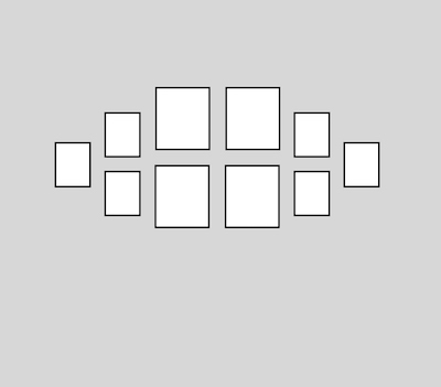
Symmetrical – where corresponding parts that are similar or exactly similar are opposite one another around a central point. Symmetrical groupings are classic, ageless style.
OR…
Asymmetrical – where elements are positioned off-center to one another or not equal to one another. Asymmetrical groupings require more thought but remain interesting longer.
 Symmetrical |
 Asymmetrical |
Shape
Grouping shapes can vary greatly, often solely determined by the space available.
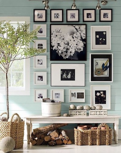
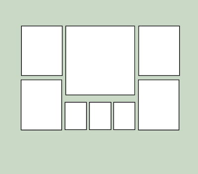
Rectangular groupings may have any number of images and variety of sizes, but emphasis should always be placed on the largest image. All other parts of the group should be secondary to the main image.
Radial groupings not only draw the eye into the middle of the group, it creates movement as the eye continues circling around the group. Be careful to keep space between each element the same to create a unified group.
 Rectangular |
 Radial |
Alignment
Alignment can make or break large groupings, balancing the group when done correctly or creating clutter instead of a cohesive unit when done wrong.
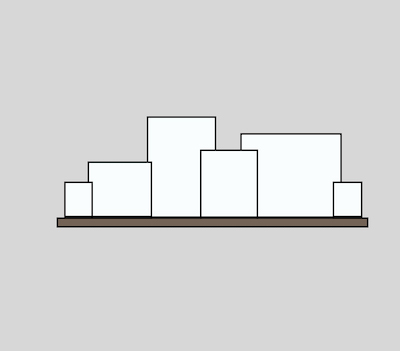
Linear alignment can be horizontal or vertical but either way, there is one straight line included in the grouping.
Edge alignment can be centered where space between each piece is identical OR outer edges of the group are aligned, but spacing between each is different.
 Linear Aligned – Bottom |
 Linear Aligned – Center |
 Center Aligned |
 Outer Aligned |
It doesn’t matter if your portraits are framed (with or without matting) or frameless such as gallery wraps or metal prints, these ideas will work with all types, sizes, and materials. Get your prints out and get your creative juices flowing!


